Key Highlights
- Nokia changes its iconic logo for the first time in 60 years
- The new logo consists of five different shapes that make up the word Nokia
- The telecommunications equipment manufacturer is focused on an aggressive growth
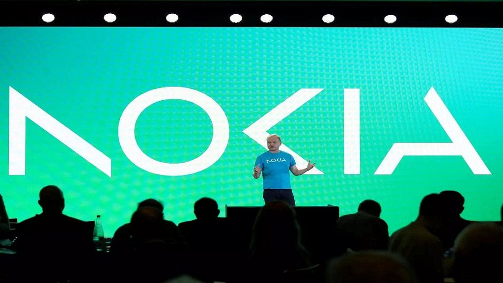
For the first time in almost 60 years, the Finnish telecommunications and consumer electronics company Nokia modifies its logo. The original logo’s blue color has also been replaced with a range of colors that will change depending on their use. Nokia CEO Pekka Lundmark said on the eve of the annual Mobile World Congress (MWC) event in Barcelona that the logo change is part of the business strategy the company is going to follow. Also Read | Nokia T21 Vs Moto Tab G62 Vs Samsung Galaxy Tab A8: Best Android Tablet Under Rs. 20,000 In India
What Nokia CEO Said About The Logo?
After Lundmark was assigned the position of CEO, he took out a three-level strategy to improve the conditions within the company. His strategy included three steps: reset, accelerate, and scale. The reset phase is over and the company is starting the next step.
According to Pekka Lundmark, “There was the association to cellphones and today we are a business technology company. We achieved really good 21 percent growth in enterprise last year, which is presently about 8 percent of our revenues, (or) two billion euros ($2.11 billion) roughly.” “The signal is pretty clear. We only want to engage in firms where we can see global leadership,” Lundmark said. “We want to move that to double digits as rapidly as possible.”
Also Read | Nokia T21 Vs Moto Tab G62 Vs Lenovo M10 Tab HD (2nd Gen) Tablet: Best Option For Budget Audience
The company also intends to review its current commercial ventures, aiming to develop only those that will enable it to become a leader on the world stage in the future. The company also plans to take steps such as divestitures to sell businesses that it deems unviable to continue.
All these actions will also enable Nokia to compete against numerous large IT corporations, such as Microsoft and Amazon.
What Does The New Logo Look Like?
The new Nokia logo consists of five different shapes. Earlier, the company logo used to consist of simple, bold blue letters. However, customers may now notice the color scheme of the logo (Nokia New Logo). This implies that the business IT market will now be the company’s new area of focus.
Also Read | Nokia X30 5G Vs Nothing Phone 1: Which Should Be Your Pick?